The combination of black and white is nothing new. It’s been a classic staple in fashion and interior design for ages, and has become even more popular over the past few years. It’s next to impossible to ignore the dramatic contrast this look creates.
I’ve been really interested in black and white business cards lately. Limiting yourself to only black and white requires a refined design skill set, because you aren’t allowing yourself to rely on colors to deliver your message. Shapes, texture and negative space become incredibly important, and the designer is often forced to eliminate any frivolous or unnecessary elements.
Since business cards generally fall into a certain size range, there’s only so much space available to really pique a person’s interest. It has to happen immediately, which is why I think the dramatic black and white combination is often so successful. Here are a few black and white cards that caught my attention recently.
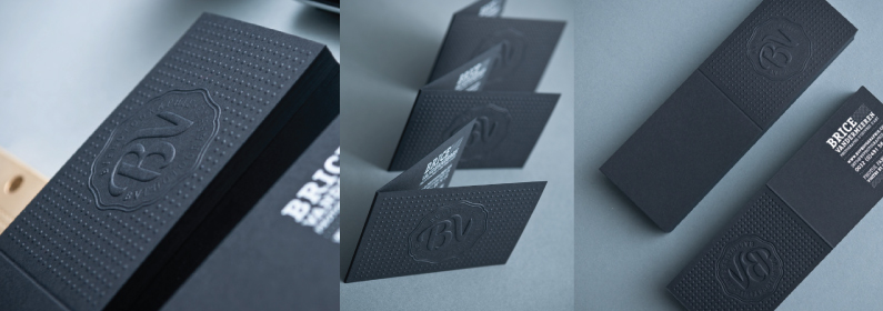
These gorgeous cards are bound to get anyone’s attention because they’re nice to look at and fun to touch and interact with. The combination of techniques could have easily been too much. Embossing, plus folds, plus letterpress can be a lot all in one design, but because the designer kept the color palette minimal, it ended up very successful.
I love the choice to keep the white text on the inside, because it allowed the embossed monogram on the front to serve as a sort of book cover, which you don’t often see.
These cards belong to a well-known letterpress studio in Florida, and it shows. What’s interesting is the printing technique. While the card appears to be embossed, this look was actually achieved through an uncommon letterpress plating process. This process also allowed the black ink to be very close to 100% opaque, which ups the drama factor significantly.
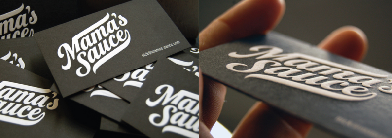
Having a text based logo is a good choice for many companies, and can be just as powerful as one that relies on imagery. One of my favorite things about this card is that the contrast and negative space really allow the letters to stand out as if they were symbols themselves.
These cards couldn’t really get much simpler. Everything, including color, has been stripped away except the email address and a few markers to indicate other ways to contact. This is a very clever idea, if you happen to have an email, twitter and website which match perfectly.
I wish I could see the cards printed, and possibly in a different typeface, but I do really like the idea. Stripping down designs to their basic, necessary information can be a really good thing, because it forces people to focus on what’s important.
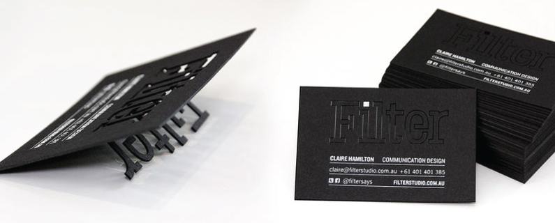
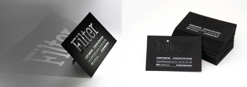
These cards may not be the most practical, but they are certainly impressive, especially in photographs. Die cuts around the letter forms fold down to create a stand, making this one of the more unique and dramatic cards I’ve seen in awhile. Any other colors in this design would have taken away from the interesting contrast and shadows the cut-outs create.
Negative space can make or break a design, and in this case it not only made it, it really was the defining feature.
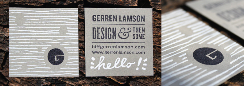
I always appreciate the time and effort people take to create hand-made business cards, and these are no exception. Each card is hand-stamped and hand-written in either black or white ink. This is a slight stretch for a post about black and white cards, since the paper is a natural grey tone, but I wanted to include it, because the look is still very simple and the three colors are all neutral.
Unlike the rest of the designs featured, this one feels less dramatic and softer. We don’t often associate black and white with softness when they’re combined together, but this designer has managed to pull it off nicely. The thin lines and natural grey paper contribute to that look and keep the black and white from overpowering the design.
