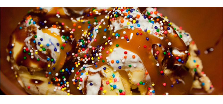
Think of your five favorite foods. Now imagine pouring them all into a bowl and mixing them up. Unless your favorite foods are ice cream, chocolate syrup and ice cream toppings, (or you happen to be Buddy the elf) this combination probably doesn’t sound appetizing anymore, does it? That’s because all those ingredients, while delicious on their own, don’t necessarily complement each other.
This same idea can be applied to design. There are many different ingredients or styles and techniques to choose from, but trying to use them all in one place would be complete chaos. If there is too much going on, or if certain elements of the design conflict with each other, your viewer will most likely feel overwhelmed and your message will be lost.
I often have to remind my clients of this, especially if I’m working on a branding project for a new company. I totally get that you’re excited about this company and you want your logo to show off how great you are (AT EVERYTHING!!), but a logo can only do so much for you. It’s meant to be an icon to represent your brand’s style, but it can’t (and shouldn’t) tell your whole story.
It’s almost always better to focus on one idea and really show that off rather than to try and make a design be everything all at once. For example, trying to design a logo that conveys how high-quality your product is while also focusing on your low prices is extremely difficult. This is due to the fact that the colors, fonts and symbols we typically associate with quality are the complete opposite of the ones we associate with saving money. Trying to blend these conflicting ideas into one logo means neither can come off as strong as they would on their own.
Just as a chef carefully considers and edits the ingredients in a recipe, a designer should always consider the elements of a design and how they relate to each other. I’ve often found the best recipe for a successful design is the simplest.
photo credit: stevendepolo via photopin cc
