With such a rich history, it was important to really understand Denison Parking, their specific needs and how the business has evolved..
In the late 1920s Denison Parking developed one of the first paid parking facilities in the country.
The name Denison comes from the landmark hotel that once occupied the space. Since developing their first facility, the company has been a national leader in the parking industry, and in 1954 the first self-park garage in Indianapolis was built. This garage was only the fifth self-park facility ever constructed in the united states. The previous version of the logo was created by a former employee.
It was important to the Denison team that we keep the overall concept of the logo, but improve on some of the areas that were not longer working. The skyline is what has represented Denison for so many years, and it was the thing that we needed to keep in order to maintain the spirit of the brand. I created a new, simplified skyline that was recognizable as Indianapolis and felt more substantial than the previous line drawing. The typeface needed to be something much easier to read on a small scale for mobile, but also on an extremely large scale for the garage signage.
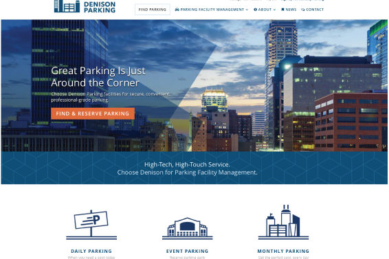
The fresh new logo has a versatility that just wasn’t possible before. The brand now includes a set of custom icons which are tailored specifically to Indianapolis and the Denison Parking facilities, and the geometric lines and patterns have been carried throughout the web design.
Visit Denison Online: Denison.com


