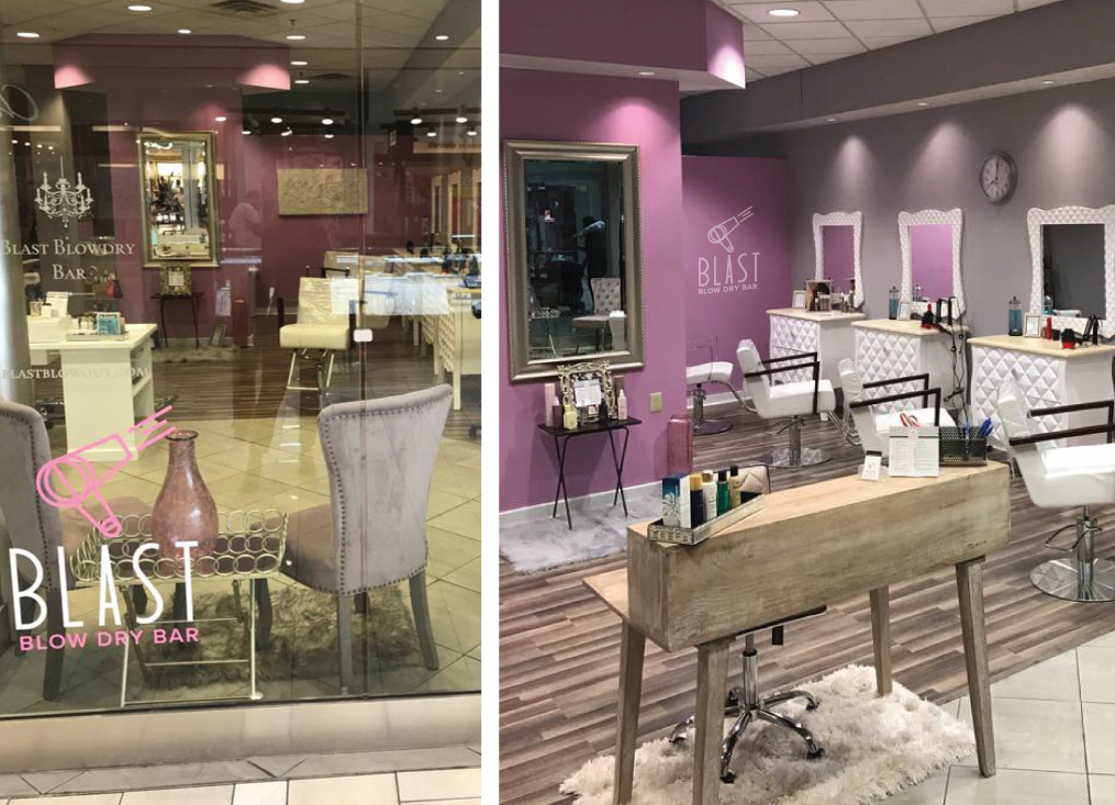
When Maria, the owner of Studio M Salon contacted me about helping to brand her latest business venture I was immediately intrigued. Blast Blow Dry Bar was a concept she had been planning for a long time, and she had a very clear vision of what she wanted it to look like. I worked closely with her as she planned everything from the paint colors to the furniture.
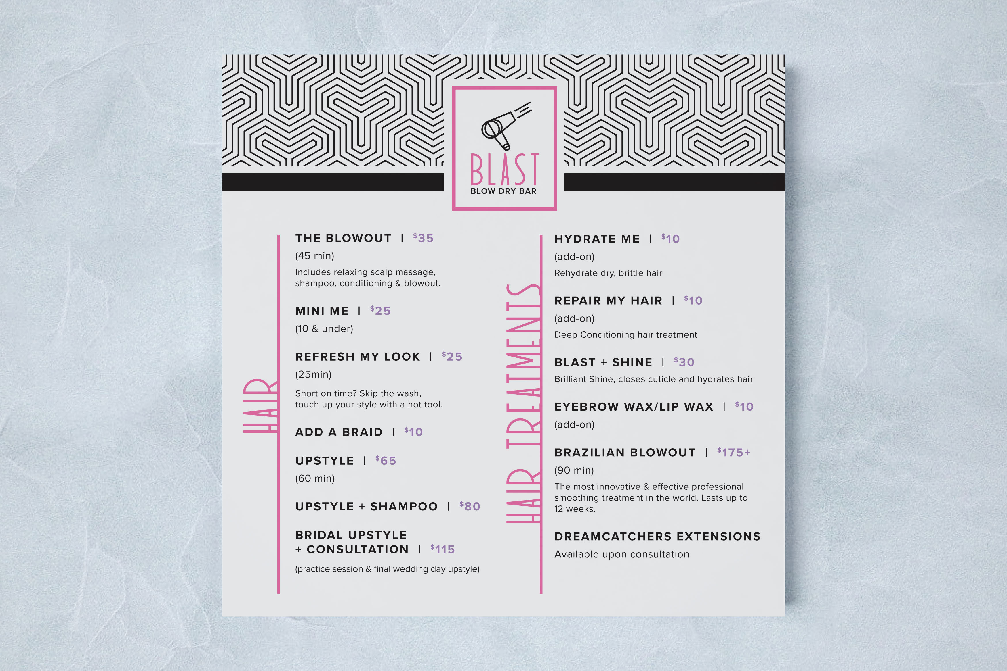
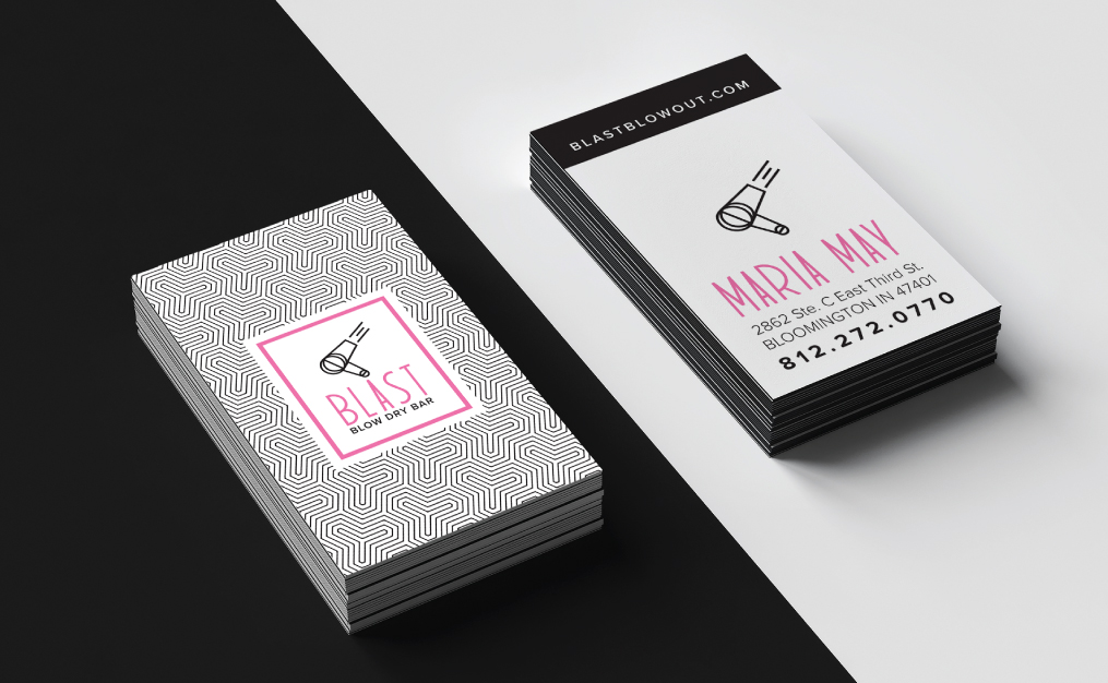
When it came to the branding, she wanted something that really stood out from the other blowout bars she had been researching, but she wasn't exactly sure what direction felt right for the business. I presented her a range of very different options to help guide her, and we ended up with something that aligned perfectly with her big personality and playful, feminine style. The typeface was chosen first, and it was a perfect fit with its unique, dramatic proportions. I created the hair dryer icon based on the curves, line weight and geometric style of the typeface. Next I designed a custom geometric pattern to bring in some line weight variation and a sense of movement to the branding.
When it came to the branding, she wanted something that really stood out from the other blowout bars she had been researching, but she wasn't exactly sure what direction felt right for the business. I presented her a range of very different options to help guide her, and we ended up with something that aligned perfectly with her big personality and playful, feminine style. The typeface was chosen first, and it was a perfect fit with its unique, dramatic proportions. I created the hair dryer icon based on the curves, line weight and geometric style of the typeface. Next I designed a custom geometric pattern to bring in some line weight variation and a sense of movement to the branding.
