I don’t do resolutions for the new year. Besides being a pessimist and somewhat of a contrarian, I just don’t like setting unrealistic and/or cliché goals for myself. I do however, like starting the year off with a little bit of design research and thinking about ways to improve my own process and expand my creativity.
One thing I’ve been thinking about lately is the way I choose color palettes. I often find myself sticking to the same tried and true combinations. They are solid, familiar and easy to work with, which makes them seem like the no-brainer choice. The problem though, is that after using them time and again they can cause my designs to seem uninspired, lazy and worst of all – safe.
Clients often come to me with a very specific direction and have good reasons why they need a certain color to be included. For instance, it’s rare to see a landscaping company with no green in their branding, and that unspoken rule makes sense. Other times, clients need my help making these choices, and it’s important that I have a good understanding of colors, specifically how they work together and what they say to the viewer.
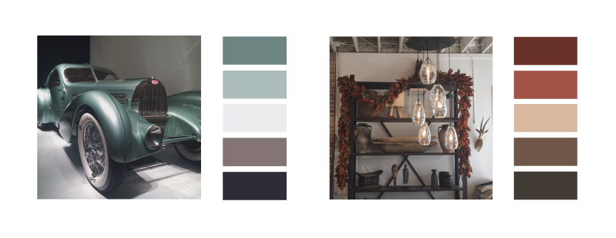
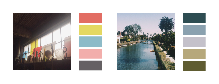
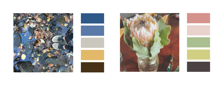
In order to challenge myself to explore new color combinations, I’ve been making a point to be more aware of the color palettes surrounding me on a daily basis. Looking back on some of my own photos, it’s easy to see what drew me to want to capture that particular moment, and many times the answer is color. Sure, a good portion of my Instagram is made up of my nieces and nephews and their ridiculous antics, but I also like to include scenes from nature, a favorite store, or just a glimpse of my everyday life.
Many times in the past, when I’ve considered color palettes for a project, I’ve gone to a site like Colour Lovers for inspiration. These sites are helpful at times, and while there’s nothing wrong with this method, I’m learning to keep my eyes open to the world around me. I’m starting to take notice of lighting and unexpected colors and trying to document them whenever I can.
I don’t necessarily intend to use these color schemes for a particular client or project, but it’s a great exercise in being observant, and I might stumble upon a few combinations I wouldn’t have tried on my own. Next time I’ve got a client interested in soft, feminine colors for their branding, I might just think back to the time at brunch when I learned about a flower called White Mink Protea and had the good sense to take note of its color palette.


