There is a lot of debate these days on whether a homepage should still be considered the most important page on a website. There’s no doubt this used to be true, but with the current state of social media things have changed. We now have a desire to constantly share and link directly to pages we find interesting, which means the homepage is sometimes not the first page viewers see.
This doesn’t mean homepages will go away anytime soon, they are still necessary and extremely useful. Your homepage is still an important representation of your brand and a way for visitors to navigate the rest of your site.
This relatively new lessening of importance of the homepage has allowed many companies the opportunity to take some risks with their site’s design and functionality. One area where we’re seeing some new ideas is in logo placement. These unconventional sites are visually interesting, but for many companies it’s just too risky to rearrange elements so drastically.
Here we’ve ranked logo placements by risk level, so you can decide for yourself which is right for you when it comes time to redesign your site.
This is by far the safest option and also the most common. It’s exactly where we expect to see a logo when we get to a site. The Western world reads from left to right, so this conventional layout makes perfect sense when you want your logo to be easy and intuitive to spot. Oreo and Tazo have similarly sized, very inoffensive logo treatments. This predictability makes it easy for the viewer to move on to more substantial areas of the site.
This slight variation from the previous examples deserves a mention because it implies a company has achieved a high level of brand recognition. The Nike symbol is so ingrained in our brains we don’t ever need to read the company name again. So while the logo placement is safe, not just any company could get away with scrapping text altogether. Target is another example of a brand with an icon that is just as strong on its own as it is accompanied by text.
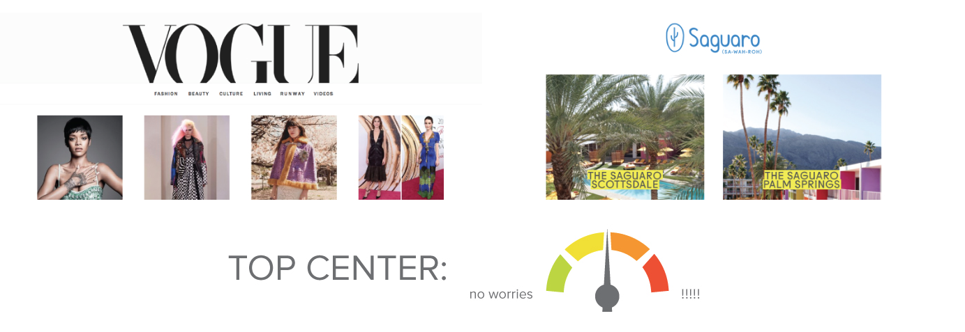
There’s nothing unsafe about this placement. A centered logo commands attention and gives the site a nice sense of visual balance. This placement is great for a company with a strong logo and works really well for editorial sites such as Vogue, as well as sites that need to immediately branch into smaller sites, such at the Saguaro Hotels. Another perk of a centered logo on top is that this design translates seamlessly into mobile responsive layouts.
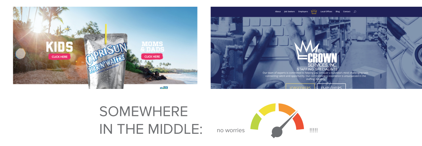
Occasionally you’ll find a site with no logo in the header. Usually the logo is snuck into the primary graphic or photo, so it doesn’t require too much hunting, but it may take a second for the viewer to acclimate to. Capri Sun went all out and created a fun logo treatment on their distinct packaging, which aligns with their brand. Crown Services has removed their logo (minus the small icon) from their header and instead uses it to create a dramatic visual that consumes the entire page.
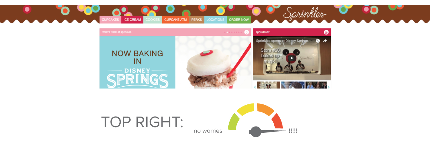
It’s uncommon to see logos on the right side of the header. There’s something a little unsettling about this location, which is not to say it couldn’t work for certain companies. On one hand, a right aligned logo would set your site apart from competitors, but it may cause some confusion for visitors and create awkward navigation. The Sprinkles Cupcakes logo takes significantly longer to locate than it would in a traditional layout. A better way to utilize this placement would have been to keep the header very clean and clutter free, so as to allow the eye to find the logo with less effort.
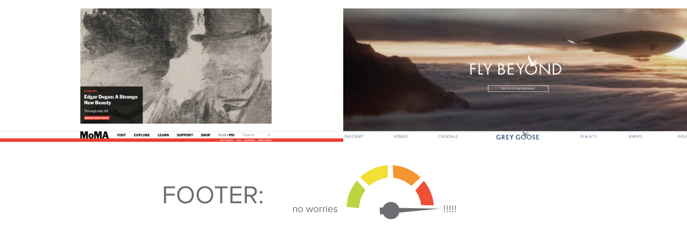
Probably the rarest logo position is at the very bottom of the site. It’s common to see a version of the logo repeated in the footer, especially in a site requiring a lot of scrolling, but when the entire navigation is in the footer it’s a pretty drastic deviation from the norm. This is an extremely risky design choice, and not suitable for everyone. MoMA manages to pull it off because it feels like a purposeful way to make viewers really see the art displayed above. Similarly, when I visit the Grey Goose site I get the impression they don’t care as much about the main navigation and they really want to make sure people interact with the video call to action at the top of the page.
So what will it be? Should you play it safe or live life on the edge? The answer really depends on your industry, target audience and what you’d like to accomplish. Be sure to do your research and don’t forget to think of the user experience. Following trends can be exciting, but not if you take things too far and alienate potential customers with a confusing logo placement and layout.
[This post was originally published by Jenna Giles for Roundpeg]
