A couple weeks ago, my boss came back to my desk with a certain mischievous look on her face that always sends me straight into panic mode. I know all too well this means she’s either got something up her sleeve, or she’s hoping I do. She tried to be casual as she said “soooo, what do you think about the new Microsoft logo?”
At this office, we love a good new logo debate, and I usually end up writing a blog about it. This time was different though, I didn’t have anything snarky to say. Sure, when I heard Microsoft had updated their logo for the first time in 25 years I was excited to see it, but I found myself extremely disappointed.
I wasn’t disappointed because it was an awful looking logo. In fact, I would have actually preferred that. If that were the case, I would have written this post about it a week and a half ago. I felt really let down by the mediocrity of it. My first thought was, “haven’t I seen this before?” And while I hadn’t seen this exact logo before, there was still nothing that felt fresh about it and therefore nothing to write about.  A few days later I started thinking about it again and realized I wasn’t apathetic, I was annoyed. Microsoft is a large, established company with a lot of history, and they are currently trying to recreate their image and be seen as a more innovative and creative organization. With their company history and almost unlimited resources, you’d think they could come up with a logo which felt new and fresh while staying true to the Microsoft brand.
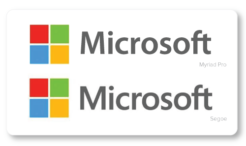
Unfortunately, this logo doesn’t feel new or fresh. This font is really similar to Myriad Pro, which is the Apple font. A quick Google search told me the font is called Segoe, and it’s owned by Microsoft. Out of curiosity I decided to recreate the Microsoft logo using the Apple font, and while I was able to spot some minor differences, I was shocked to see just how alike the two fonts are. It’s understandable for designers to be inspired by other successful brands and to use them as motivation to create something equally remarkable, but Microsoft has fallen way short. Personally, if I were part of Microsoft’s design team, I would be extremely cautious and aware of how our brand stacked up to our fiercest competitor’s. I’m shocked the designers were happy to settle with what I consider “almost catching up” to Apple’s sleek and minimal style.
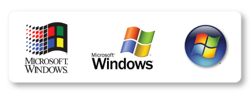
Another aspect I find strange is the decision to throw away all elements of past logos, minus that pesky little “ft” ligature (the way the two letters join together). What is that all about, anyway? Nothing about the new logo is reminiscent of Microsoft’s branding history, which would have actually been a far more interesting direction to take it. Instead, they chose to slap a simplified Windows icon on it and call it finished. Not only does that seem like a lazy move, it’s confusing, since Microsoft encompasses so much more than the Windows operating systems. In a quote from the Microsoft blog, Jeff Hensen, the General Manager of Brand Strategy said, “The symbol’s squares of color are intended to express the company’s diverse portfolio of products.” So instead of creating a unique symbol to represent this new strategy, we’re supposed to change the way we view a symbol we’ve known since 1990 as the Windows logo.
In the end, it seems like Microsoft took the easy way out. While their new logo isn’t terrible, I think everyone expected more. In an attempt to catch up to the competition they ended up creating a lackluster logo which fails to represent their brand’s history, and most importantly, fails to be innovative.
