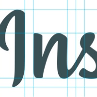
You probably didn’t notice, but Instagram released a new logo recently. Before you freak out, yes the camera icon remained intact. We can all breathe a collective sigh of relief, for our little rainbow camera friend made the cut, and it was only the type which was redesigned.
The change was fairly subtle, which is why it went mostly unnoticed. For a designer, this is sort of a big deal, and something to get excited about. Sometimes tweaking a logo is actually more difficult than creating one from scratch, because you’ve got to find the perfect balance of old and new.
I will confess that while I’m an avid Instagram user and a designer myself, I didn’t realize how much the logo needed an upgrade until it actually happened. This is a really good thing, because it means they didn’t wait until the logo felt dated to redesign it. I’m guessing Instagram has some other changes planned for the near future, and if that’s the case, they are smart to have their new branding all sorted out beforehand.
Using the same style and quirkiness of the old logo and just streamlining it was a good solution. The original typeface was called Billabong, and while it was an interesting and fun script font, the new hand-lettered logo flows together in a much nicer way. The letter “I” was the most recognizable part of this wordmark, so changing it was a risk, but it seems to work well due to its similar weight and hand-written feel. The biggest benefit of using custom lettering is that the designer is able to kern the logo so all the letters are properly spaced. The new logo’s cleaner look will also make it size down much easier, which is extremely important since Instagram is primarily a mobile-based application.
The designer, Colorado based Mackey Saturday, actually posted some interesting images of the design process on his Dribble page, which give a glimpse into the process of this type of redesign. While definitely not life-changing, this was a really good example of how to tweak a logo as a brand grows up and evolves. Making improvements to a logo without compromising the brand’s personality can be a challenge, but when done properly can really make the brand stand out.
