There are so many typefaces out there to choose from, it often seems like an overwhelming task to decide which ones are right for your project. Type should always be an integral, consistent part of your brand, so this is not a decision to be made lightly. Hiring an expert is almost always a good idea, but when that isn’t an option, there are a few quick ways to know whether a typeface is going to be easy to work with or a complete nightmare.

Cases, Numbers & Symbols:
Assuming we are talking about type for headlines and body copy, not logos, you will at some point need all of the above. Fortunately, most respectable type designers are well aware of this, and incorporate uppercase, lowercase, numerics and standard symbols, but it’s always smart to check first.
One of the greatest risks of using free font sites is that the submissions aren’t regulated for quality and consistency, so it’s important to download the fonts first and check each character closely. I’ve had many conversations with clients confused when I had to tell them the fonts they hoped to use didn’t have numbers or a lowercase option.

Weights & Variations:
One surefire ways to wreck a design is using too many typefaces. Generally sticking to one or two thoughtfully paired styles will give you the most cohesive and professional looking results.
“But how will I make things stand out?” you might wonder.
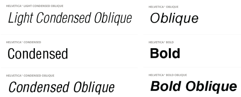
This is where variations such as Bold, Thin, Condensed, Italics etc. come into play. If you’re torn between two typefaces and you notice one has a single weight, while the other has many, choose the one with options. For headlines using a bold, slightly larger font than the body copy will give you the visual hierarchy you need, without requiring an entirely different typeface which might complicate the design.
Il1:
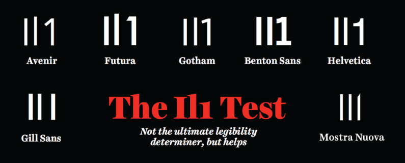
This is a quick tip I learned from one of my favorite type designer/letterers, Jessica Hische. She has a really great post on her blog with some more in-depth tips for choosing a proper typeface, but the “Il1 Test” is my favorite section.
When using a serif font for body copy, letters generally have more distinct characteristics, but this isn’t always the case with a sans-serif. An easy way to gauge whether a typeface might cause you problems down the road is to type out a capital “I”, lowercase “L” and the number 1. If there is little to no distinction between the three, this could cause readability issues. As Jessica’s graphic mentions, this isn’t a definitive way to know whether or not a typeface will work for your project, but it’s a great place to start.
There are so many things to take into consideration when faced with the endless sea of font options, but with these three tips, anyone should be able to make a more educated decision.

