
You somehow managed to find yourself on this blog post, you probably already know how important branding is. We’ve discussed the different aspects that come together to form a solid brand, and repeatedly reminded you that a brand is more than just a logo. Sure, logos get all the credit and attention, but there’s another heavyweight design element out there, and brands often overlook it.
Color is one of the primary elements which affect the overall visual experience of your brand. People subconsciously react to certain colors based on their own personal experiences and expectations, as well as design repetition (think stop signs). Whether you like it or not, people are making a split second judgment about your brand, and this impression is partially based on color
Determining a color palette that best suits your industry, values and target audience is a crucial step in the branding process. With the rise of social media and digital marketing, it’s also no longer enough to have only one brand color. Since most brands are now represented online, in print, on mobile apps etc., it’s wise to create a large enough color palette to allow for flexibility.
How many brand colors do you need?
If you use Yelp, you probably know their logo is red, black and white. However, you may have overlooked the various accent colors they use in their marketing and advertising. These colors have been carefully chosen to allow for design variety without compromising the overall aesthetic of the brand.

If your color palette still consists of only one or two colors, you may be noticing yourself or your design team struggling to create compelling icons, social media graphics and other marketing materials. As a designer I can tell you from experience, a versatile, carefully curated color palette is much easier to work with than a rigid one with limited options. Choosing accent colors will allow your designs to show more depth and visual interest. Adding these to your existing brand guide now will also streamline the design process because the colors will already be decided in advance, and easy to use any time they are needed.
The number of colors in a brand guide varies by company and by industry. If you’re hesitant about changing your branding materials, consider starting to incorporate just a couple new colors into your social media graphics and living with them for awhile. You may find people interacting with your posts more simply because you’ve slightly enhanced your brand’s visual style.
How do you find the right accent colors?
One thing to keep in mind when editing your palette, is that accent colors are not meant to dominate a design. They are intended to complement and enhance your existing color palette. For this reason, they are generally used sparingly and never alone without the main colors.
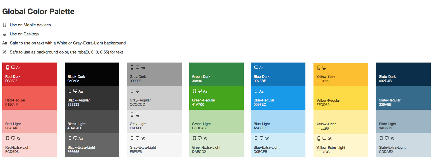
There are a couple types of accent colors, and it’s a good idea to create a palette that uses both.
Contrasting Accent:
These colors are meant to grab attention and are often brighter and “louder” than the logo colors. Think of the bright red, green or orange call to action buttons you often see on websites. Often the best choice is a complementary color to one of your logo colors. Since complementary colors are exact opposites, this option creates a nice contrast that will grab a viewer’s attention when paired with your primary branding.
Tints and Shades:
These colors aren’t a huge deviation from your current branding. In fact they are just darker or lighter versions of your existing logo colors. These are great to have if your brand includes any type of illustrations, because they allow for subtle shading and highlighting without bringing in completely new and possibly disruptive colors.
More is more. (sort of)
This doesn’t necessarily mean your brand needs to regularly use thirty new colors, but give your designs some room to grow by providing sufficient color choices and guidelines for using them. It’s a good idea to specify in advance which colors are suitable for print, web, background and text usage. You may not think your brand needs this many options now, but you’ll be surprised by how useful these colors become as technology continues to evolve.